
Materials and Construction
Why These Materials
Four presentations are offered for every image in this collection, and the material each one is built from was chosen the same way the photographs themselves are made. Not for how it reads in a specification, but for what it does to an image and to the room that image ends up in.
A surface is never neutral. Glazing that reflects competes with the photograph behind it. A frame that asserts itself takes attention that belongs to the work. A paper that flattens tonal range gives back less than the file contains. Every material described below was selected because it does the opposite, and because it will still be doing it in fifty years.
What follows is what each one is, how it is made, and what it does. Which is right for you depends on the image and on the room, and that is a conversation rather than a ranking.
TruLife Acrylic
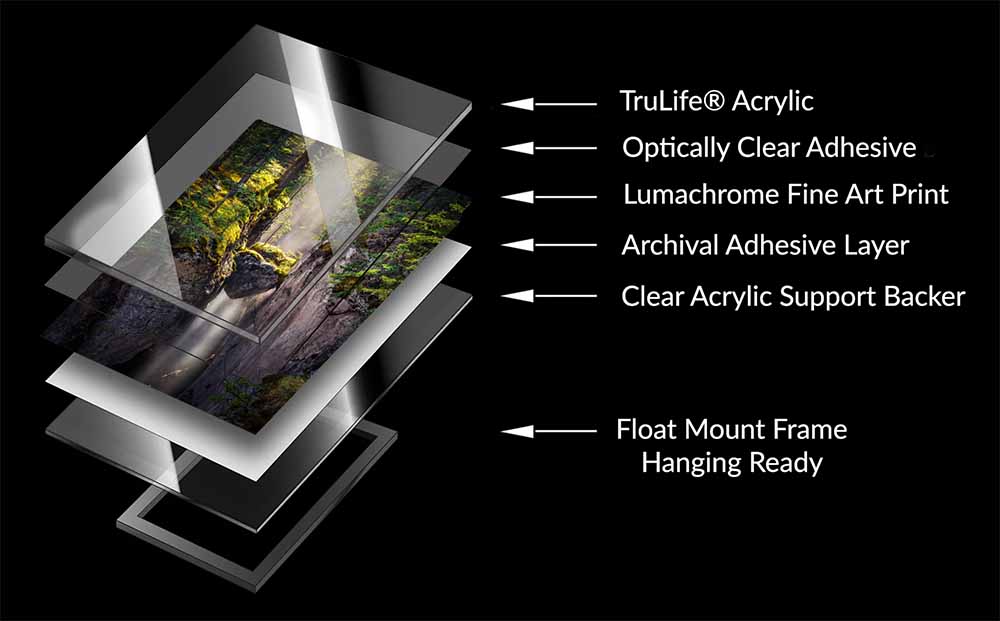
Every acrylic print in this collection is produced as a TruLife® Acrylic Fine Art print. Understanding what that means in practical terms explains why the finished piece looks and feels fundamentally different from a conventionally framed photograph.
The print itself is made on Lumachrome, a true photographic paper selected for its colour depth, tonal range, and luminescent surface character. The printed image is then encased between a crystal clear acrylic base and a top layer of museum grade TruLife® acrylic, a construction that protects the image completely from environmental harm while enhancing its visual presence. International orders are produced through WhiteWall on the closest equivalent available in Europe, currently Fujicolor Crystal Archive DP II.
Not all acrylic is equal, and for fine art printing the difference between standard acrylic and TruLife® is not marginal. Standard acrylic introduces reflections, surface glare, and a visual distance between the viewer and the image that subtly but consistently interrupts the experience of looking. For work designed to draw attention inward and hold it there, that interference is not an inconvenience. It is a direct compromise of the work's purpose.
TruLife® eliminates it. The anti-reflective coating reduces surface glare to near zero, allowing the finest tonal nuances and colour relationships to be seen without distraction. Its optical clarity adds a three-dimensional depth that conventional glazing cannot achieve. Combined with 99% UV protection, abrasion resistance, and anti-static properties that repel dust, it protects the print completely while enhancing everything that makes it worth protecting.
That absence of distraction is not a minor detail. It is central to the restorative experience the work is designed to create. An image that commands full attention without competition from surface glare does its psychological work more completely and more reliably than one that does not.
There is a practical benefit worth noting. TruLife® can be cleaned simply and gently, exactly as you would clean glass, without specialised products or particular care. A work built to last should also be easy to live with.

ROMA Italian Framing

A frame is not a border. It is the threshold between the image and the space it inhabits, and how that threshold is handled determines whether the work settles fully into a room or remains merely hung on a wall. A frame that competes with the photograph diminishes it. A frame chosen with care becomes invisible in the best possible sense, allowing attention to rest fully within the image rather than stopping at its edge.
The frames offered through this collection are made by ROMA Moulding, whose artisans have been producing handcrafted picture frame mouldings in Italy for generations. The methods are traditional, the materials are exceptional, and the knowledge behind them has been passed down within families who have devoted their working lives to the craft.
In a market dominated by mass production, that distinction matters. A ROMA frame is not manufactured. It is made, by hand, with a kind of attention to material and process that produces something genuinely different from what a factory can achieve. That difference is visible in the finished piece and felt in how the work presents itself in a space.
Each framed piece is finished with a linen liner selected to complement the image without competing with it. The choice of natural materials is not a finishing detail. It is a continuation of the work's intention. The liner and frame together add approximately fourteen inches to the finished dimensions, which is worth allowing for when planning wall placement.
Three ROMA series are offered, chosen not for prestige but for how naturally each serves the images it will hold. Each series is available in a range of finishes, from Black Lacquer and Dark Walnut in the Elite series to the Shagreen textures of the Eleganza. The choice is yours, and custom options beyond these three are available on request.
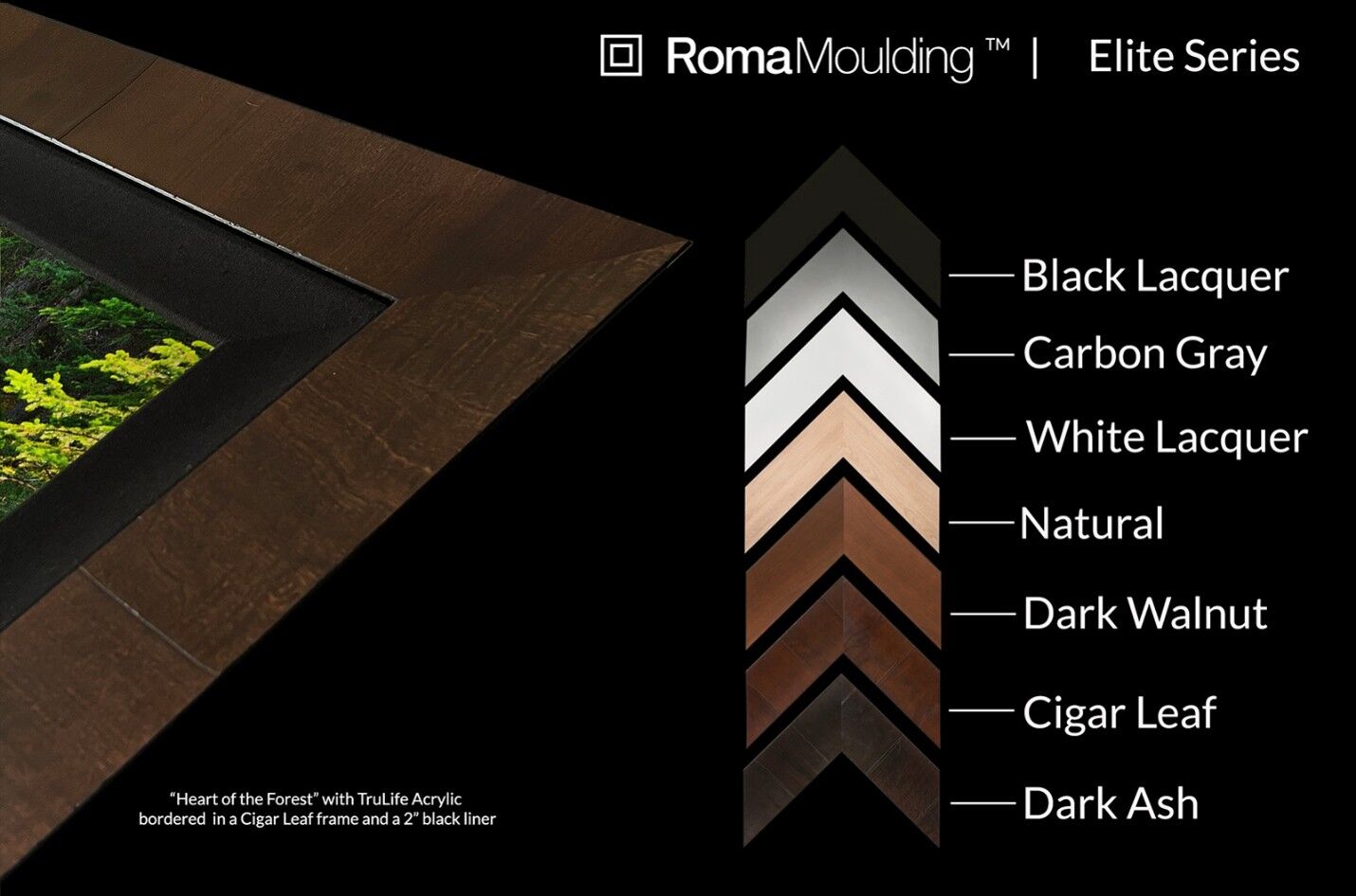
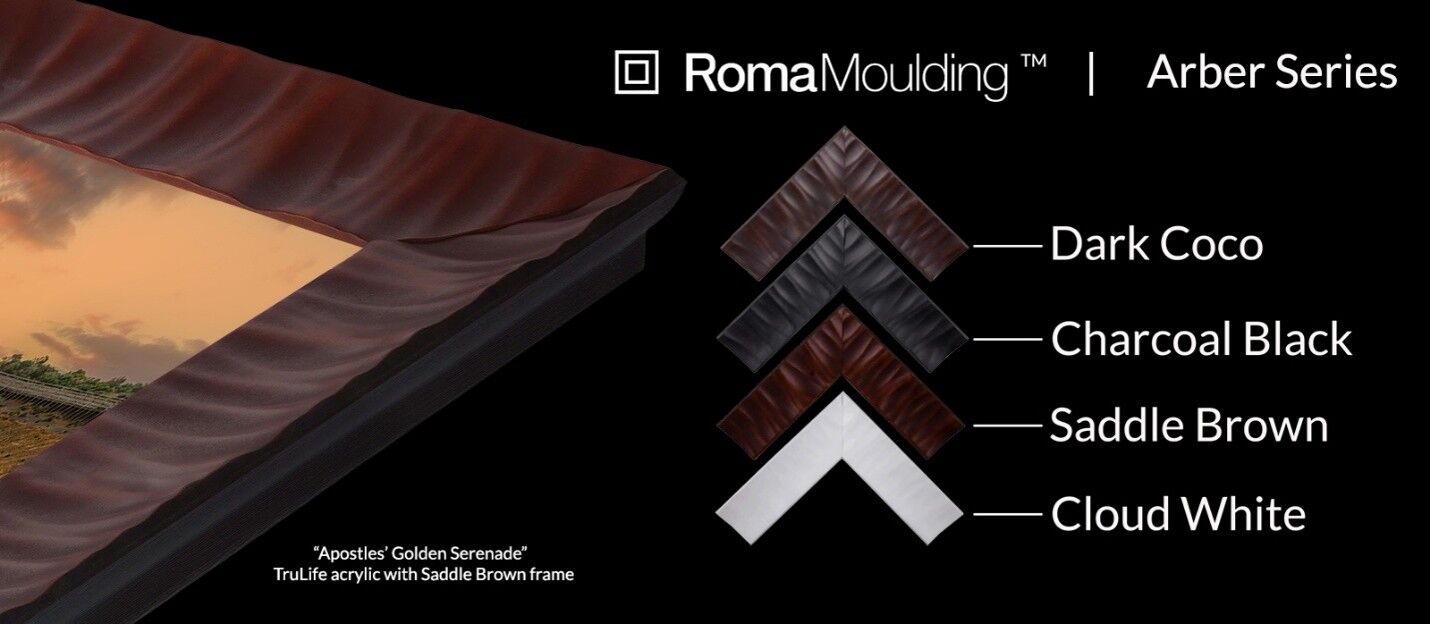
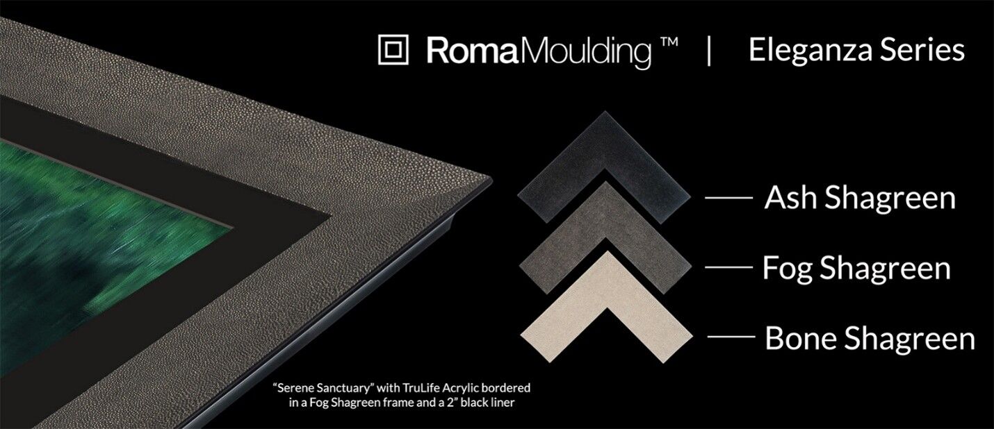
If you would like guidance on which combination of series and liner suits a particular image and a particular room, that conversation is always available before an order is placed.
ChromaLuxe Metal
Metal is the one presentation here where the image is not printed onto a surface and then protected. It becomes part of the material itself.
ChromaLuxe panels are produced by dye sublimation. Under heat and pressure the dyes move into a specialised coating bonded to the aluminium, so the image is infused into the panel rather than resting on top of it. Nothing sits between the viewer and the photograph, no glazing and no protective layer, which is why a metal print reads as more direct than anything else in the collection.
That construction is also what makes it durable. There is no image layer to scratch off. The panels resist moisture, chemicals, and abrasion, and they clean easily without particular care. ChromaLuxe publishes independent fade testing, and the panels are specified for museums, galleries, and healthcare environments where a work has to hold its appearance under conditions that would compromise a framed print.
I chose ChromaLuxe because it achieves colour fidelity and tonal depth that no other aluminium process approaches, and because it holds that appearance in environments where other materials would not. For images where the graphic structure of the landscape matters as much as its atmosphere, it is a genuine alternative to acrylic rather than a lesser version of one.
The panel floats from the wall on a concealed aluminium system, frameless and complete. The aluminium surface responds to ambient light in a way that shifts subtly across the day, which is worth considering in rooms where the light changes.

Hahnemühle FineArt Baryta
Hahnemühle has been making paper in Germany for more than four hundred and forty years. That is not decoration on a product description. It is four centuries of accumulated knowledge about what paper does, and it is why their FineArt papers are the standard against which others are measured.
FineArt Baryta is a 325 gsm bright white sheet, one hundred percent alpha-cellulose, acid and lignin free, and conforming to ISO 9706 for museum-grade age resistance. Its high-gloss inkjet coating produces deep blacks, striking contrast, and reproduction of colour and detail that holds its own beside acrylic and metal.
The barium sulphate within that coating is what gives the paper its name and its character. It is the same compound used in traditional darkroom baryta papers, and it produces the same effect: a surface with genuine depth rather than a flat print. Beneath the coating is a clearly visible felt structure that gives the sheet a tactile texture and the print a three-dimensional quality most apparent at close range.
I chose it because it comes closer than any other paper to matching the reproduction of the acrylic and metal presentations while remaining unmistakably paper. Highlights stay luminous, shadows keep their nuance, and light meets the surface directly rather than passing through glazing first.
Prints are supplied unmounted with a border for matting and ship rolled in a protective tube, which leaves the framing decision with you. The paper surface is unsealed, and that is precisely what allows it to look the way it does. It also means a Fine Art Edition print should be framed behind glazing rather than hung bare, and it is worth budgeting for that framing when comparing this option against the others.

One Considered Thing
Every decision described on this page follows the same principle that governs the photography itself. Nothing is chosen for appearance alone. Everything is chosen for what it does to the work and to the person who will live with it.
A print from this collection is a complete object. The image, the substrate, the surface, and the mounting are not separate elements assembled together. They are a single considered thing, made from the inside out to create a particular experience in a particular space.
No two rooms are alike and no two collectors want the same thing. Scale, room character, existing materials, lighting conditions, and the atmosphere you want the work to create all bear on which presentation is right. If you would like to think that through before deciding, please reach out. These are decisions that benefit from dialogue.
Compare the four presentations
Editions, scale and acquisition
Care and handling
Start a conversation
Browse The Collection