Why Black and White Fine Art Photography Feels So Calm
How Monochrome Images Create Calm, Focus, and Emotional Depth
People often assume that black and white is what photographs looked like before we had a choice. The truth, at least in my work, is the opposite. Color is the default the world hands me, and black and white is the decision I make on purpose. When I stand on a basalt shore at first light and watch a single weathered sea stack hold its ground against the tide, I am not recording the scene so much as listening for what it is actually about. Very often, the answer has nothing to do with color. It has to do with form, with light, with the quiet weight of a thing that has stood far longer than I will. To reach that, I let the color go.
I have written before that removing color helps the eye notice shape, line, and light instead of being pulled toward the color of the sky. That is true, and it is where most explanations of monochrome stop. But the more I work in black and white, the more I have come to see it as something larger than a technique for managing distraction. It is a way of designing a particular kind of attention, and that is the real subject of everything I make. For me, black and white fine art photography is not about removing beauty. It is about removing distraction.
In this article, I want to explain why I choose black and white for certain images, how monochrome changes the way we see, and why these prints can feel especially calm in a living space.
.
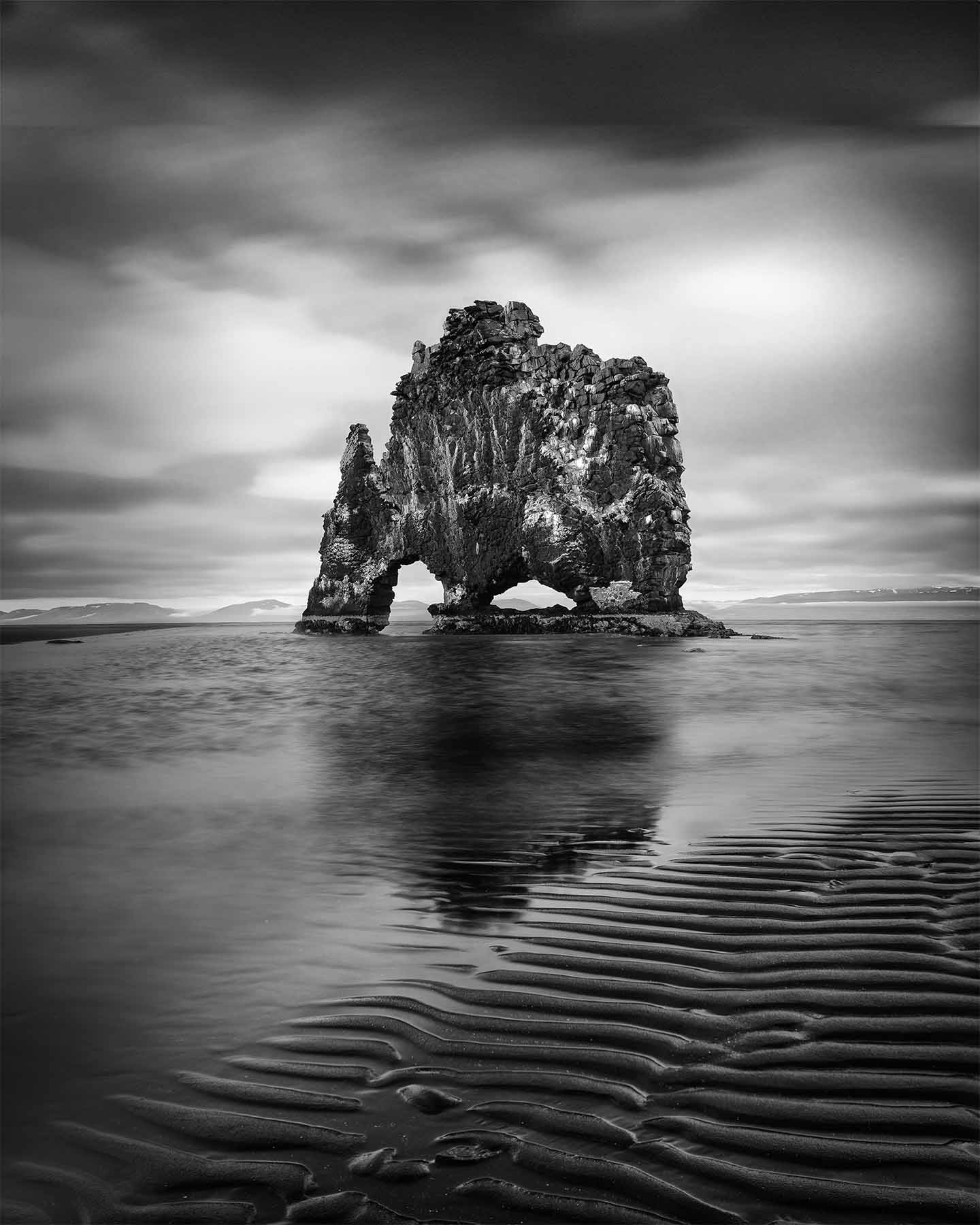
View Available Prints of Lone Guardian
Less to Process, More to Feel
Color gives the brain a lot to process. In a bright scene, the eye has to read hue, saturation, contrast, and detail all at once. When I remove color, the image becomes quieter. When I remove color from an image, I am removing an entire channel of information that the mind would otherwise have to manage. What remains is quieter. The photograph asks less of you, and in asking less, it gives you room.
This matters to me because my work is built around the reduction of mental noise rather than the addition of more visual stimulation. A monochrome print is, quite literally, a simpler signal. The eye is not negotiating a bright foreground against a competing sky. It follows tone and line without friction, which is closer to the kind of effortless, undemanding attention that researchers studying attention restoration and landscape art describe as genuinely restful. Color photography can be beautiful and immersive. Black and white is often calmer, and calm is the experience I am most interested in offering.
.
View Available Prints of All Is Not Lost
A Print Is an Interpretation, Not a Record
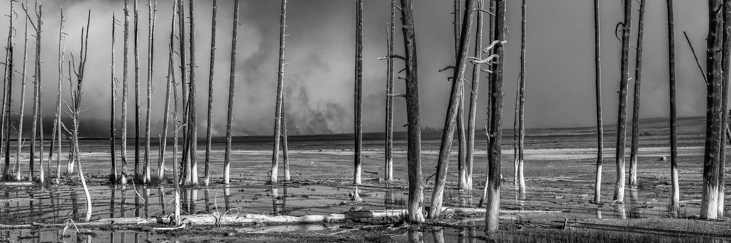
When I look at a canyon like this one, with the river threading through it like something alive, the color version is essentially a transcription. Reds, ochres, the particular blue of distant haze. It tells you what was in front of the lens. The black and white version cannot do that, and that is exactly its strength. The moment I decide how that warm sandstone wall becomes a specific shade of gray, or how far the sky deepens toward charcoal, I am making choices that have no single correct answer. The image stops being a record of a place and becomes an interpretation of it.
This is the heart of why monochrome belongs in a fine art practice rather than a documentary one. A color landscape can hide behind the scene itself, as if the photographer simply happened to be standing in a beautiful spot. A black and white print cannot hide behind the scene. Every shade of gray is a choice. That means the final image clearly carries the hand and vision of the artist. This is also why I keep returning to the idea that the work is not really about the scenery at all. What you are responding to in an image like this is not the canyon. It is a particular way of seeing the canyon, held still long enough to live with.
.
View Available Prints of The Serpent's Watch
When Light Becomes the Only Subject
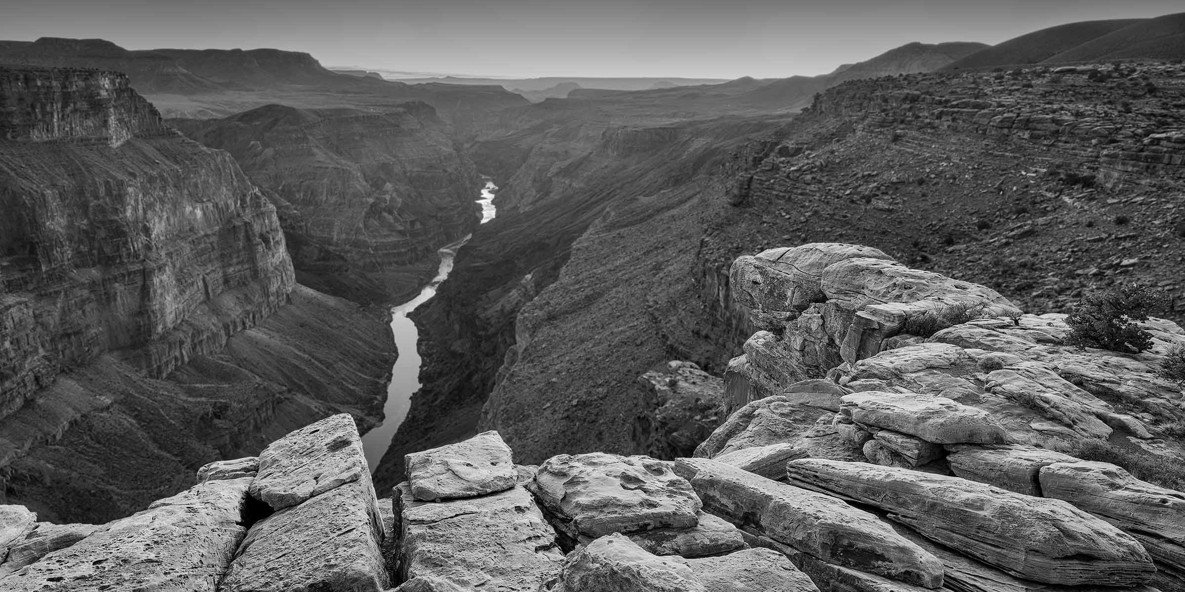
Photography means drawing with light, and nothing makes that more literal than removing color. In a frame like this waterfall, there is almost nothing else to attend to. Bright water against dark rock, luminance against shadow, the soft vertical fall of light reading against the broken texture of the cliff. Strip the color out and the image becomes a study in pure tone. The water is not white because water is white. It is white because that is where the light lives, and the eye goes straight to it.
.
View Available Prints of Weeping Wall
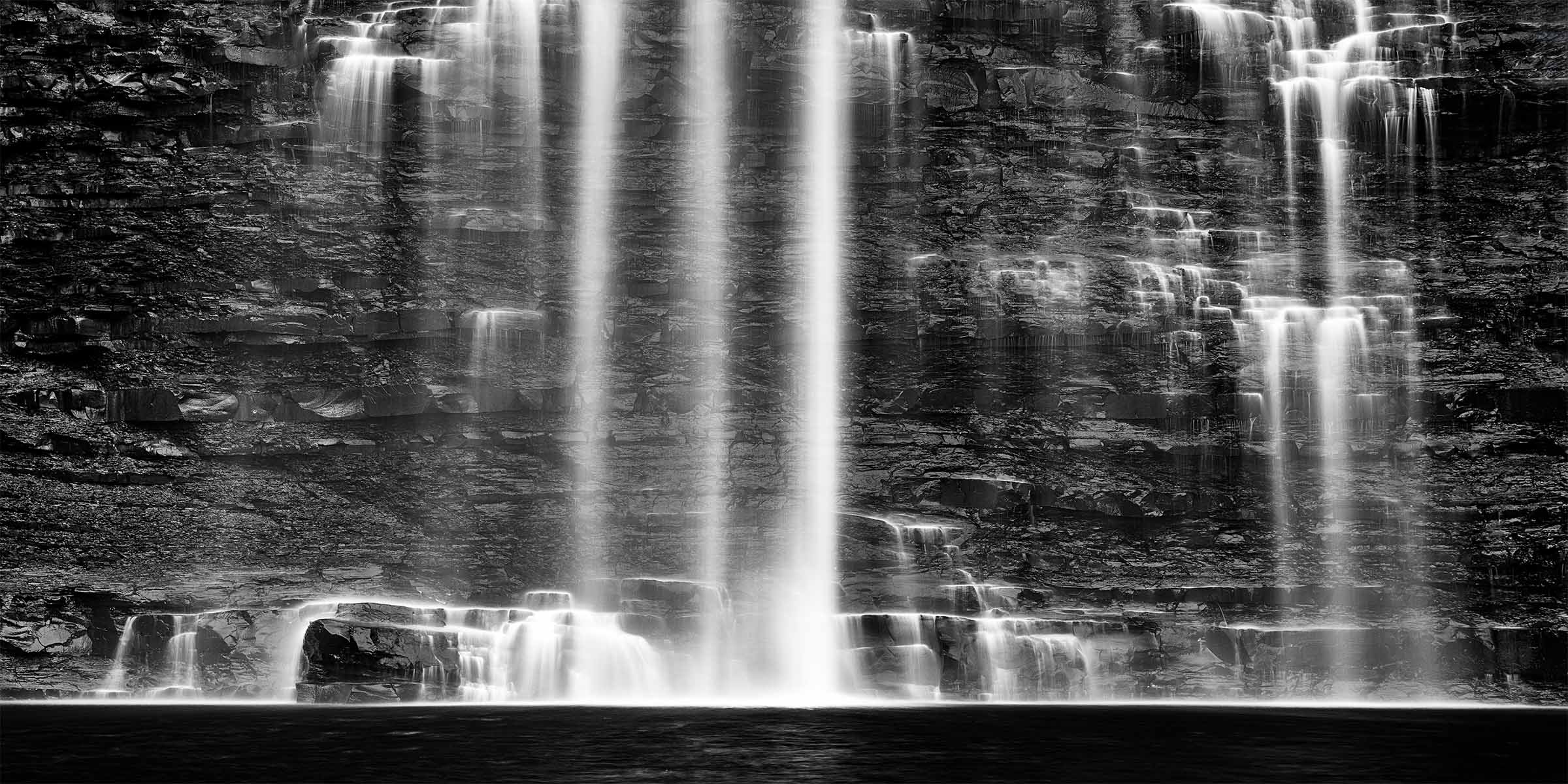
The same principle carries this bamboo stairway, where a single point of light breaks through the canopy at the top of the climb. In color, the scene would be a wash of greens, and the eye would spend its energy reading the foliage. In black and white, the light source becomes the destination, and the path leads you toward it. The way natural light shapes the emotional register of a landscape is something I have explored at length in my writing on the language of light, and monochrome is where that language is spoken most clearly. There is research from environmental psychology suggesting that scenes offering a sense of depth and a clear focal point tend to feel both safe and engaging, a pairing described in the work on restorative environments. A bright path leading into shadow gives the eye somewhere to go. It feels safe, interesting, and calm at the same time.
.
View Available Prints of One Step Into Quiet
Form, Texture, and the Patience of Time
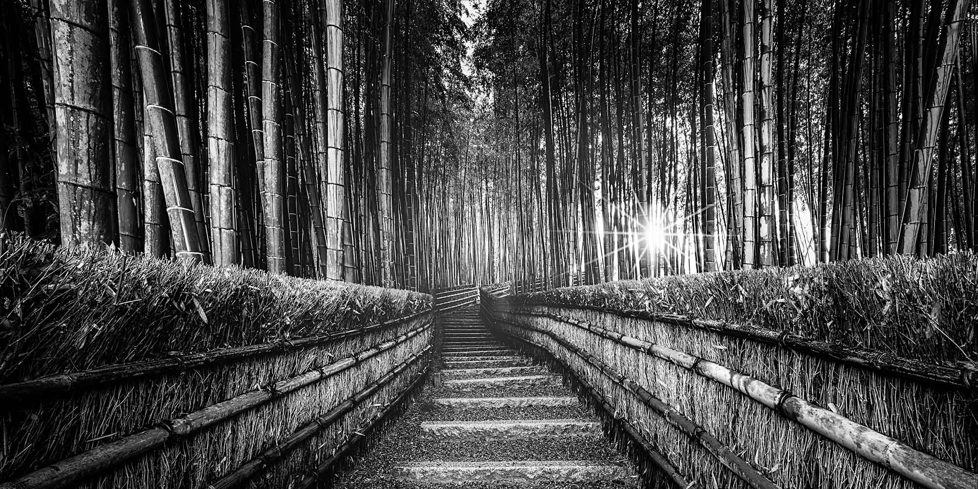
Certain subjects simply speak more honestly in monochrome. These weathered poles, all that survives of a structure the sea claimed long ago, are fundamentally about form and surface. The plain vertical lines of them standing against the smoothed water, the grain and slow decay worn into each post, the way the long exposure turns the tide into something still and almost breathing, and the quiet symmetry of their reflections drawn out beneath them. Color would only describe the wood. Black and white lets you feel its age, and the patience of the water that is unhurriedly taking it back.
.
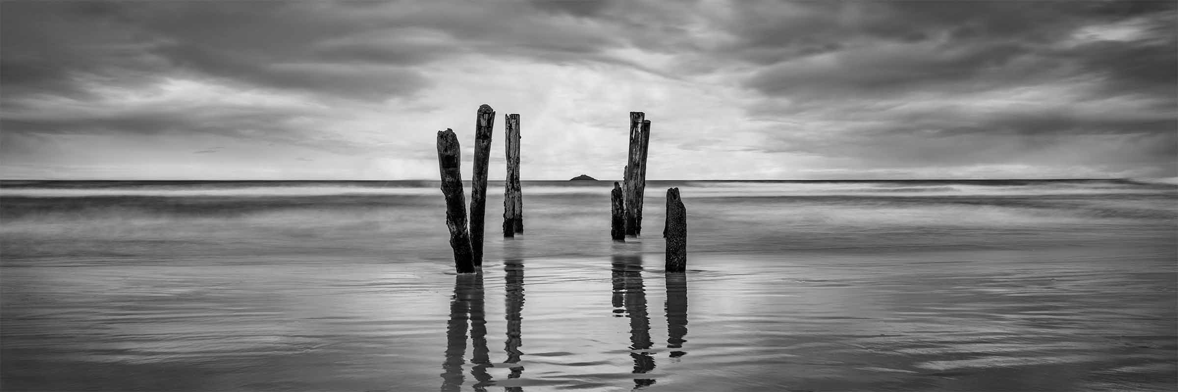
View Available Prints of What Remains
The desert works the same way. In this image the rock face of the range and the ribbed columns of the saguaros become a conversation about texture and endurance, two kinds of slow life standing in the same dry light. There is a reason monochrome has long been the language of the most serious landscape photographers, the tradition that runs through figures like Ansel Adams and Michael Kenna. It is the format that takes geological time seriously. When I want an image to feel as though it has always existed and always will, I almost always reach for black and white, because color carries the faint signature of the moment it was taken, and these scenes are not about a moment.
.
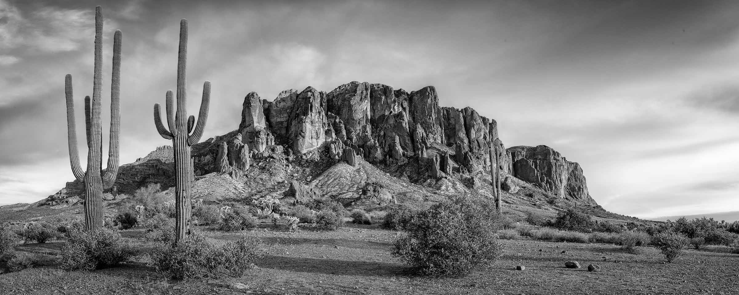
View Available Prints of Age Old Superstitions
What the Frame Reveals
Sometimes the absence of color reveals the actual story. This abandoned tunnel, slowly being taken back by water and fern, is a scene about time and reclamation. In color, the eye would catch on the rust, the green moss, the brick. In black and white, what surfaces instead is the relationship: the dark mouth of the tunnel, the curtain of water at the threshold, the perfect reflection laid out along the rails. The image becomes quieter and stranger, and it invites the kind of sustained looking that I value far more than an immediate, easily consumed impression. A monochrome print also has a practical grace worth mentioning. It belongs on any wall, in any palette, never competing with the colors of the room around it, which is part of why I think so much about how art shapes the feeling of a space.
.
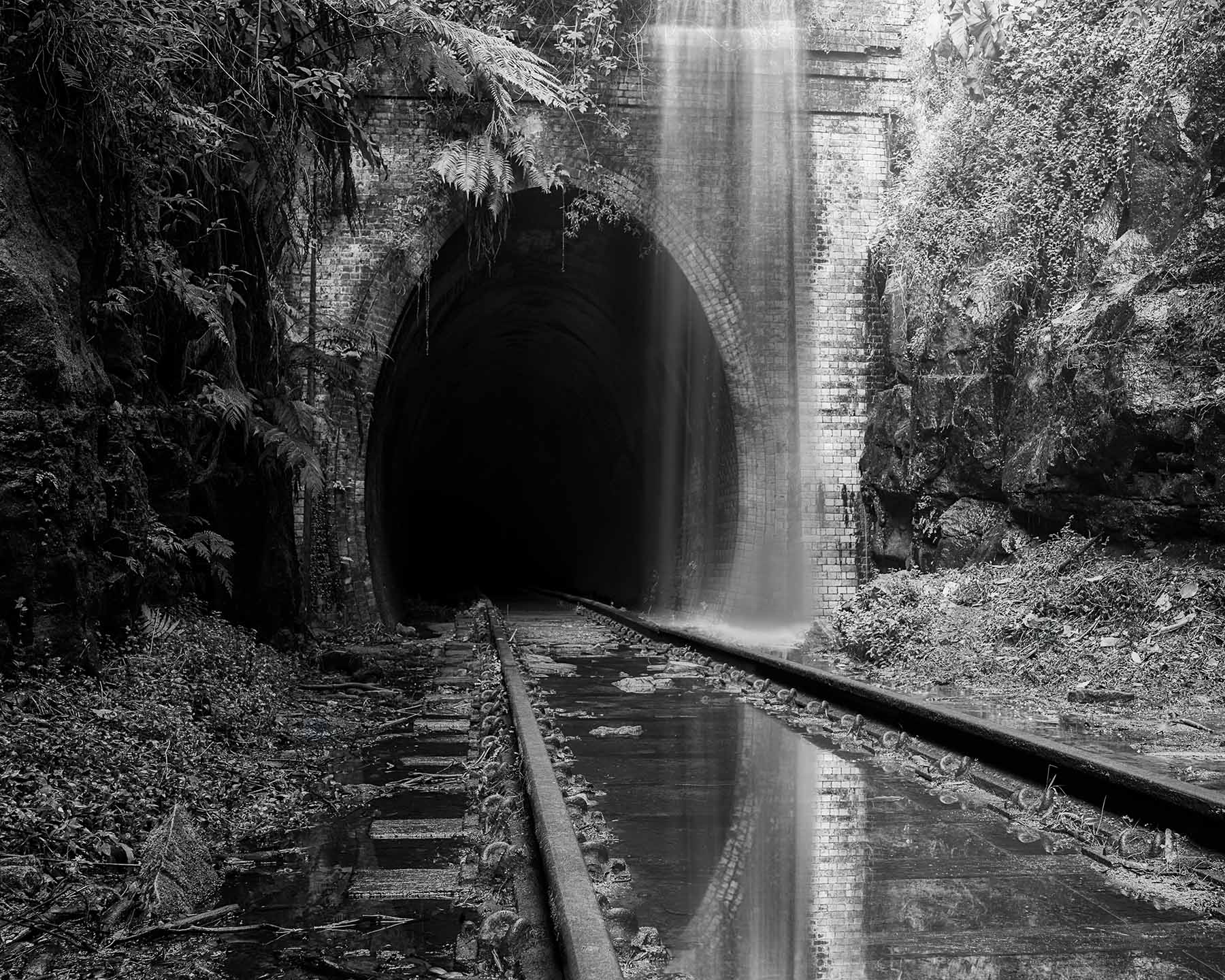
View Available Prints of Reclaimed
When I Choose Color Instead
I should be honest that I do not print everything this way. Some images are fundamentally about color, the particular gold of an autumn stand or the brief alpenglow on a peak, and converting those to gray would strip away the very reason they exist. The choice is made image by image, and the decision itself is part of the craft. Black and white is not a filter I apply to look serious. It is the answer to a specific question I ask of every photograph: what is this image actually about, and does color help me say it or get in the way.
When the honest answer is that the color is the message, I keep it. When the answer is that the image is about light, form, weight, or stillness, I let the color go and trust the print to carry the rest. More often than not, with the work that matters most to me, that is exactly what happens. The color steps aside, and the photograph finally says what it came to say.
Living With a Black and White Print
Black and white prints are also easy to live with. They do not compete with wall color, furniture, or changing design trends. A monochrome landscape can work in a quiet bedroom, a professional office, a wellness space, or a large living room because it brings structure and calm without adding visual noise.
Every monochrome image I make is offered as a limited edition, archival print, built to be lived with for decades rather than glanced at and replaced. If one of these photographs has held your attention longer than the others, that response is worth trusting. I invite you to spend time with the full black and white collection, where each piece can be seen at the size, paper, and medium that suit it best.
If you are considering a particular wall, a quiet room, or a larger space meant to slow the people who move through it, I am always glad to talk through scale and placement personally. You can inquire about a specific image or a commission whenever you are ready, or join my list to stay connected be among the first to see new black and white work as editions are released. There is no urgency in any of this. The work is meant to be chosen the way it is meant to be experienced, slowly and on purpose.