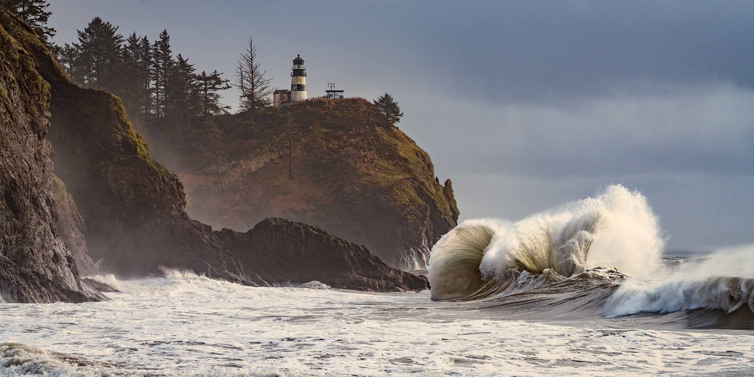
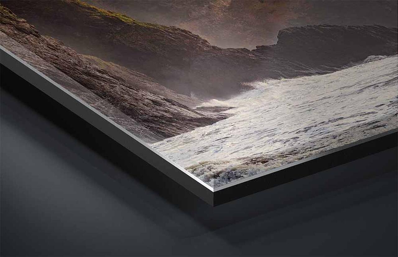
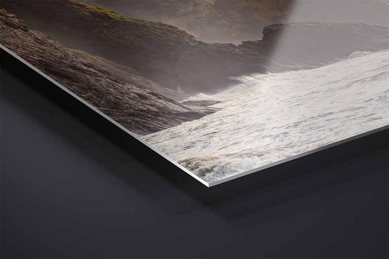
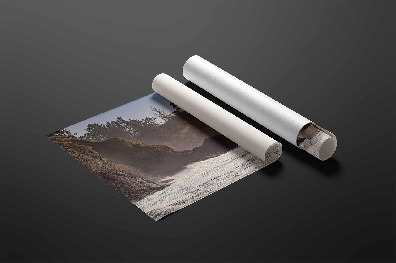
A 2:1 horizontal photograph of the Cape Disappointment Lighthouse above a breaking king tide, Washington, available as a limited edition print in three sizes.
Artist's Story
Cape Disappointment has been disappointing no one for a very long time. A British captain named it in 1788 after failing to find the mouth of the Columbia River and sailing away frustrated. What he missed is one of the most dangerous stretches of water in the world, where the outflow of a continental river meets the open Pacific across a shifting bar. Ships have been going down there ever since. The lighthouse on the headland went up in 1856 because the place demanded one, and the vessel carrying its building materials wrecked on that same bar three years before it was finished.
I went in January during a king tide and stood as close to the water as I was willing to stand, waiting on the right wave.
Something goes wrong with perception in a place like that. Everything in view is moving. The surf, the spray, the foam running back down the sand, the air itself full of water. A visual system needs something that is not moving in order to work out where the body is, and when it cannot find one, the result is the particular unease of a whiteout or a fog bank. The lighthouse solves that, and not metaphorically. It is a fixed reference in a field of motion, which is exactly what it was built to be for ships, and it does the same job for a person standing on the beach below it.
The Steady Light is that fixed point, holding its place above water that has never once held still.
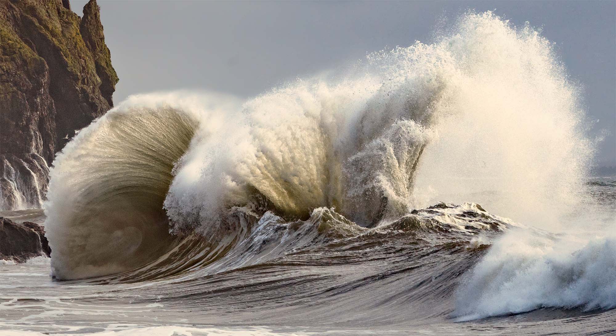
The breaking wave and the base of the headland, about one third of the frame width. Water arriving on the right, water still running off the rock on the left. Click to view at full size.
About This Photograph
Photographed at Cape Disappointment, at the mouth of the Columbia River on the Long Beach Peninsula in Pacific County, Washington, in January during a king tide. This is a single frame image in color. The subject is the Cape Disappointment Lighthouse, completed in 1856 and the oldest operating lighthouse in the Pacific Northwest, standing above the Columbia River Bar. The bar is one of the most hazardous river entrances in the world, where the outflow of the Columbia meets the open Pacific across sands that shift with every season. More than two thousand vessels have been lost there since 1792, which is how the water off this coast came to be called the Graveyard of the Pacific. King tides are the highest tides of the year and extend the reach of the surf well beyond its usual limit. Presented as a horizontal panorama, offered as an archival limited edition from 40 by 20 inches to 80 by 40 inches on acrylic, metal, or archival paper.
The Steady Light
Steve Austinhttps://www.steveaustinphotography.com/
Location
Cape Disappointment, Ilwaco, Washington
Subject
A king tide wave breaking at Cape Disappointment
Capture
Single frame, fast shutter, January king tide
Format
Photograph · horizontal panorama, 2:1
Sizes
40 × 20 in · 60 × 30 in · 80 × 40 in
Print Media
TruLife Acrylic · ChromaLuxe Metal · Baryta paper
Edition
Limited, 25 / 50 / 100 by presentation
What it Does in a Room
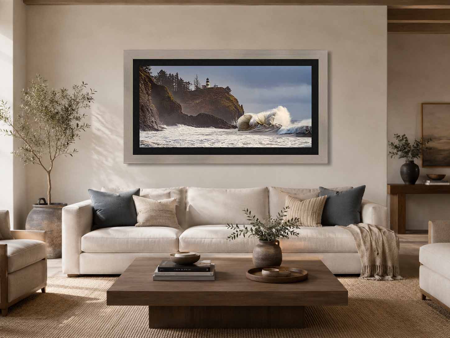
A wide photograph of something in motion does what a still one cannot. It gives a quiet room a pulse.
Two to one is the panoramic proportion that still holds a scene. Wider than that and a photograph becomes a band, read left to right like a sentence. Narrower and it reverts to being a picture on a wall. At two to one the frame is decisively horizontal without giving up depth, so the image can have a foreground and a distance rather than only a sequence. In a room it works with the architecture instead of against it. Most walls are built on horizontal lines, and a wide frame extends them, which is why this shape settles above a sofa, a credenza, a long console, or a headboard more comfortably than any other. It asks for a run of wall rather than height. Give it one and it makes the wall feel longer than it is.
Here the width is carrying two halves that do different work. The left is stone and standing timber, fixed and dark and going nowhere. The right is a wave at the moment it breaks. The picture asks the eye to move between them, and that traverse is the whole experience of the frame, which is why the shape matters more on this photograph than on most. The tonal structure suits more rooms than a storm picture usually does. There is a cool blue gray through the sky and a warm olive brown across the headland and wet rock, with the foam sitting between them as a soft bone white, so the image has something to agree with in a warm room and something to agree with in a cool one. Values run middle weighted, with very little true black and nothing burned out at the top, which means it keeps its detail from across the room rather than flattening into a silhouette.
What it rewards most is a long run of wall and a placement people pass rather than sit beneath. A wave at full height meets a standing viewer better than a seated one, and a hallway, a landing, a broad entry, or the long wall of a room read differently as you move along them. It also does well in a space that is otherwise still. The photograph supplies all the motion a room needs, so quiet furniture and few objects tend to let it work, and rooms that already carry a lot of visual activity ask the eye to do two things at once.
Not sure which size the room calls for, or want dimensions not listed here? Sizes beyond 80 × 40 are available on request and ship crated by freight. That conversation is welcome before an order is placed. Start that conversation and I will answer within one business day.
The Steady Light, limited edition printSteve Austin112513400USD12https://schema.org/InStock
Questions about this photograph
How small is too small for a photograph this wide?
At two to one, the Intimate size is forty inches across and twenty inches tall. That is a comfortable proportion, wide enough to read as a panorama but with enough height that it still behaves like a picture rather than a band. Of the panoramic families this is the one that holds up best at its smallest size, and a forty by twenty print will anchor a modest wall on its own. There is one thing to know about this particular image at that size. The lighthouse is small in the frame by design, and at forty inches across it becomes very small indeed, a marker on the skyline rather than a presence. That reading has its own appeal, and the photograph still works, but the sense of a fixed point holding against everything else in motion comes through more strongly as the print grows. The Collected and Statement sizes are where the width does the work. If you are weighing a size against a specific wall, choosing the right print size covers the measurements and the viewing distances in more detail.
What changes at the largest size?
The water, and specifically how many separate things it is doing at once. Look at the base of the headland, where the previous wave is running back off the basalt. At forty by twenty that reads as a bright wash down the rock. At eighty by forty it separates into a dozen distinct falls, each one holding its own strand, with dry stone visible between them. The wave arriving beside it does the same. What looks like a smooth green shoulder at the smaller size resolves into fine parallel structure across the face, the combed texture water only holds for the fraction of a second before it collapses. Those two things sit side by side in the frame, which means the largest sizes give you water draining and water arriving in the same glance, both stopped. That is the argument the photograph is making, and it is easier to see the more of it there is. Why scale matters covers what happens perceptually when a landscape reaches the size where the eye has to travel across it.
What kind of room does this photograph suit?
More rooms than a photograph of a storm has any right to. The frame carries two temperatures at once, a cool blue gray through the sky and a warm olive brown across the headland and the wet rock, with the foam sitting between them as a soft bone white. That means it has something to agree with in a warm room and something to agree with in a cool one, which is unusual. Oak, linen, plaster, and travertine bring the headland forward. Cool grays, slate, and steel bring the sky forward. The values run middle weighted with very little true black in it and nothing burned out at the top, so the image holds its detail rather than resolving into a graphic shape from across the room. What it rewards most is a long run of wall where the width can open out, and a placement people pass rather than sit under, since the energy in the right half of the frame is worth meeting at standing height. It also does well in a room that is otherwise still. The photograph supplies all the motion a space needs, and rooms with quiet furniture and few objects tend to let it.
Every work ships insured and arrives with a signed certificate of authenticity.
If a piece is damaged in transit, the choice of replacement is always yours, and your edition number stays with you.
Production time runs 2 to 3 weeks for metal, 3 to 4 weeks for acrylic and paper, and 5 to 6 weeks for framed work.
Each print is made to order and takes its place in a numbered edition, so sales are final. Before you choose, I am glad to help: send a photo of your wall and I will show you this work in your room at true scale, at no charge. Start a conversation
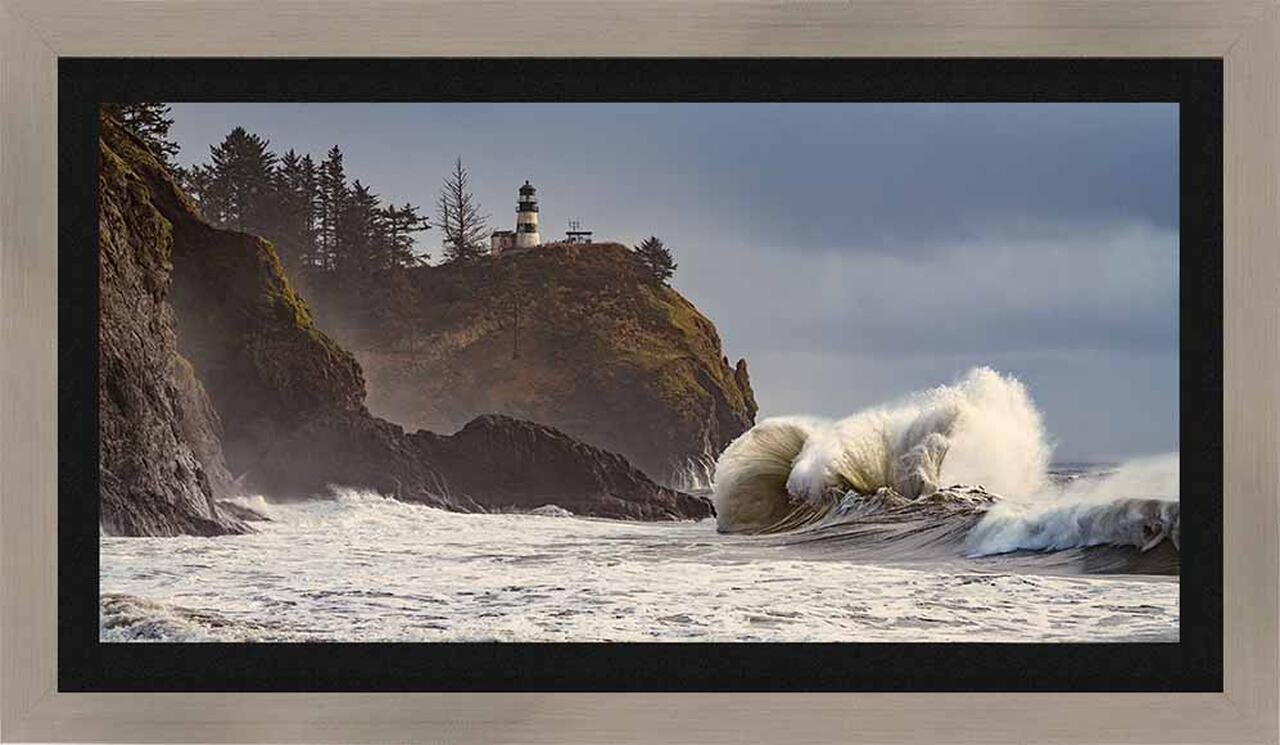
Collector's Choice · TruLife ® Acrylic in Italian Frame
Collector Edition of 25· Lumachrome TruLife Acrylic · Handcrafted Italian Frame
TruLife acrylic in a handcrafted Italian frame with a linen liner chosen for the image. Frame series, finish, and liner are settled with you after the order, and production begins from there. The frame and liner add about fourteen inches to the finished dimensions, worth allowing for when planning placement.
Signature Acrylic Edition of 50· Lumachrome TruLife · Gallery Float Mount
Face-mounted to TruLife acrylic and floated approximately one inch from the wall, with no frame to mediate between the image and the room. UV-resistant, anti-reflective, and scratch-resistant, with a lifetime guarantee against fading.
Signature Metal Edition of 50· ChromaLuxe Print · Gallery Float Mount
Color infused into the aluminum panel itself, floated from the wall on a concealed system. Where acrylic produces luminosity, metal produces clarity. Exceptional fade resistance with no glazing or coating required.
Fine Art Edition of 100· Hahnemühle Baryta Fine Art Paper
Printed without acrylic, so light meets the paper surface directly. Highlights stay luminous, shadows keep their nuance, and the surface has a tactile quality the other presentations approach differently. The understated choice, and the traditional one.
Complimentary shipping within the continental United States. International collector shipping available upon request.
Still deciding
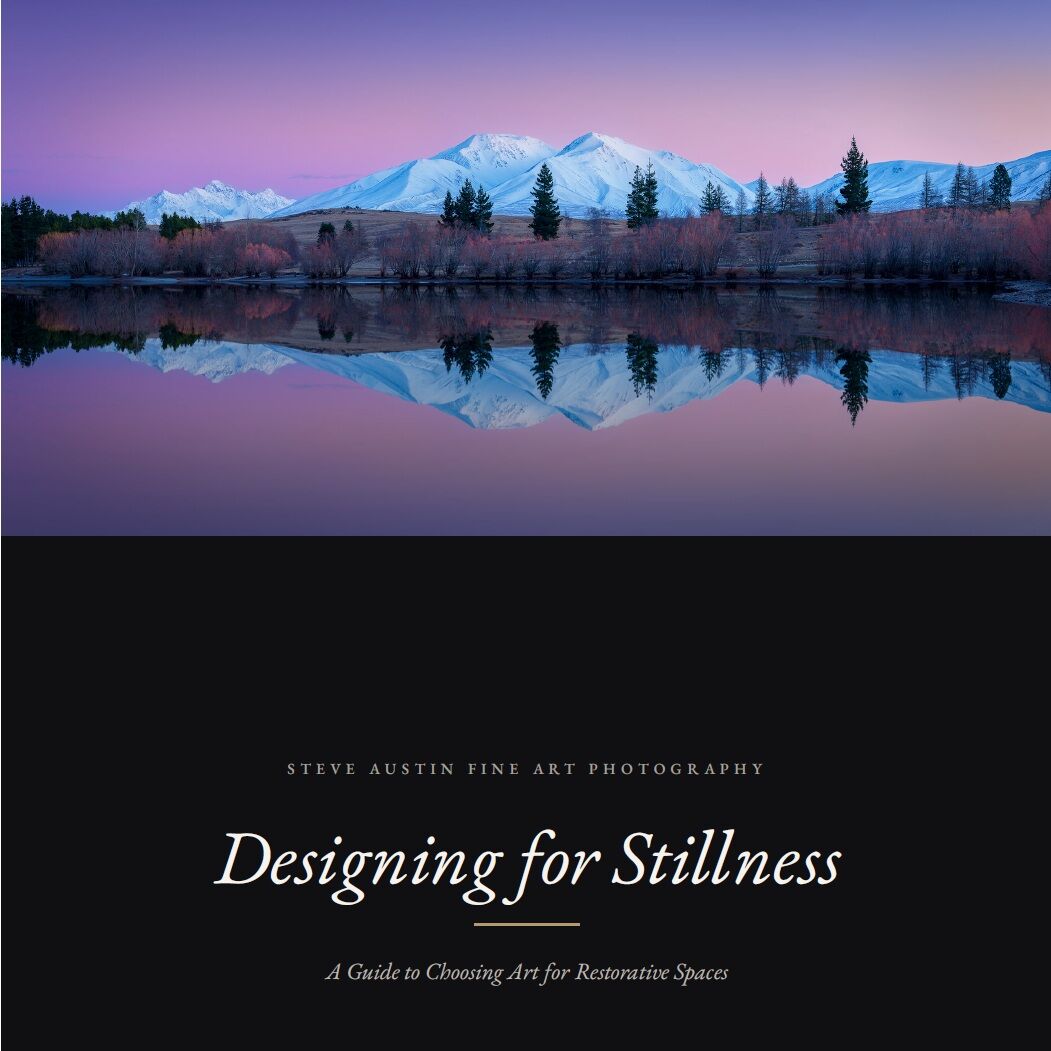
Designing for Stillness
A guide to choosing art for restorative spaces
How to tell whether an image will still hold you in a year, how scale changes what a photograph does in a room, and how to match a piece to the work a room actually performs. It cites the research it draws on, and it is equally clear about where that research stops. About ten minutes to read.