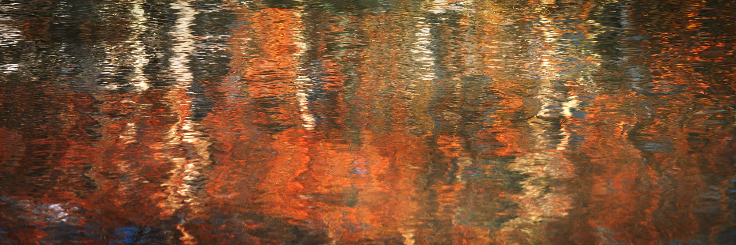
A 3:1 panoramic photograph of autumn color reflected in moving water, an abstract of orange and gold ripples, in Alberta, Canada, available as a limited edition print in three sizes.
Artist's Story
I spent a long time photographing the wrong thing that afternoon. The trees on the far bank were doing what trees in Alberta do in October, and I took the pictures anyone would take, and then I looked down.
A ripple is not a soft version of a mirror. It is a surface made of small curved faces, and every one of those faces is pointing somewhere slightly different. Each one is its own mirror, and each one is showing a different part of the far bank.
That is why this does not look blurred. Two facets sitting side by side can be sampling places twenty feet apart on the shore, so a bright leaf lands right next to a dark gap between branches with nothing in between to soften the join. Blur averages things together. This takes things that were far apart and sets them next to each other.
It is also why the color survives. Averaging is what kills saturation, and none is happening here. Every facet is delivering one color at full strength, and the next one along is delivering a different one, and the picture holds all of them at once. Measured across the whole frame this is the most saturated photograph I have made, and the reds run seventy-four points ahead of the blues.
The trees I photographed first are gone from my catalog. This is the sheet of water in front of them, about six feet across, on a day with enough wind to keep the surface working and not enough to break it.
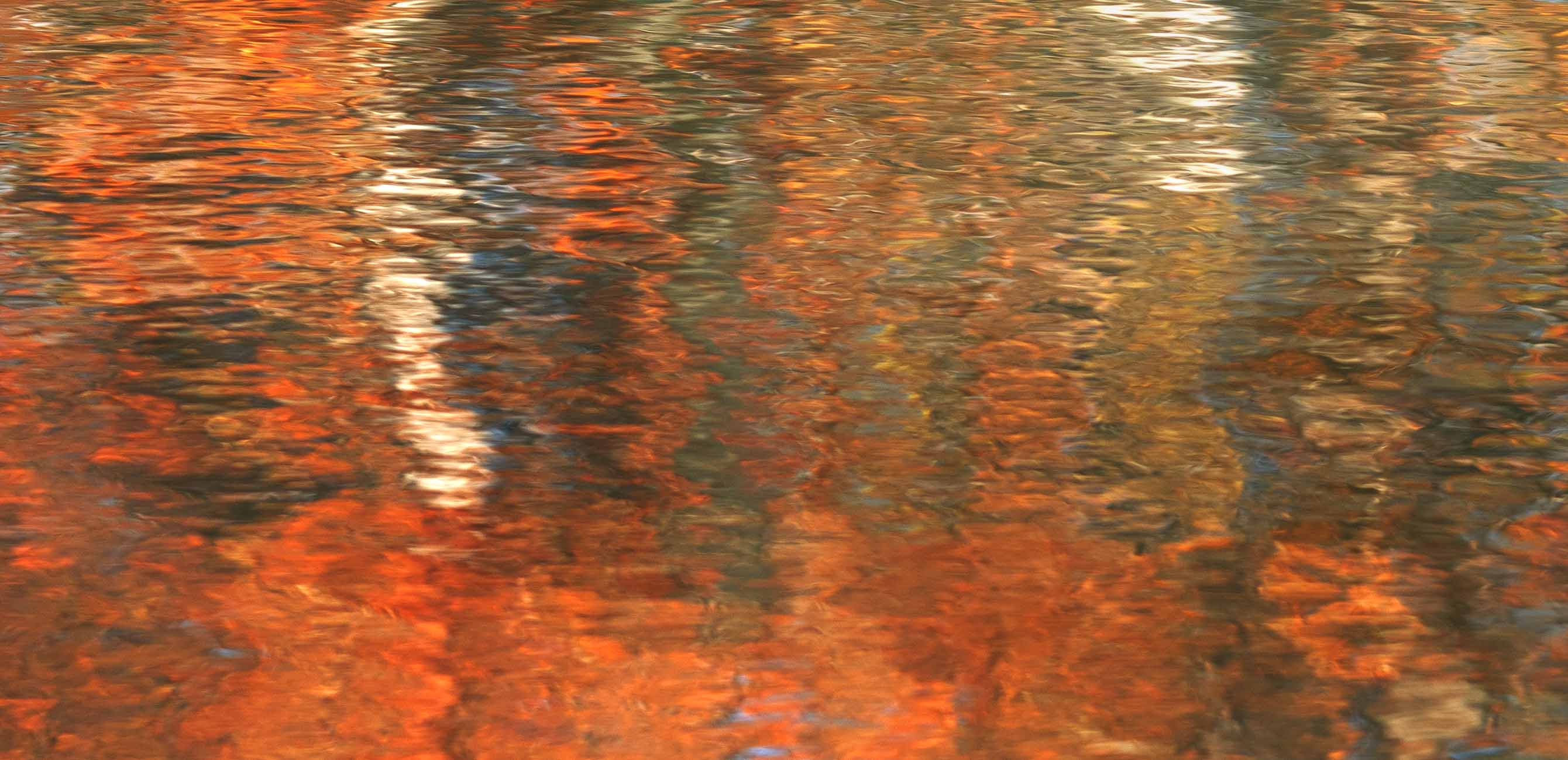
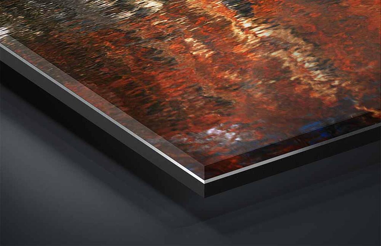
A section of the surface at about a third of the frame width. On a ninety inch print this runs roughly thirty inches across. Each ripple face resolves as a discrete tilted plane with its own color and its own brightness, and a hard edge where it meets the one beside it. An orange facet and a near-black one sit adjacent with nothing graded between them, which is the mechanism made visible. In the pale passages the reflected sky arrives as separate bright chips rather than as a glow, and toward the lower edge the facets grow larger and flatter where the surface is nearer the camera. Click to view at full size.
About This Photograph
Autumn color on the surface of moving water, in Alberta, Canada. This is a single frame image. Nothing in the photograph is above the water: every color in it belongs to a bank that is outside the frame, and what the picture records is the surface itself.
The image reads as intense, and it measures that way. Average saturation across the frame is fifty-seven percent, higher than anything else in this collection, and red runs seventy-four points ahead of blue. Every one of the four edges is warm, with individual measurements reaching a hundred and three.
Nothing in it is blown out and nothing is blocked up. Not one pixel reaches pure white and not one reaches pure black, which is unusual in a photograph carrying this much color, and it is the reason the surface holds its texture everywhere rather than dissolving into flare in the bright passages.
Reflections in Motion
Steve Austinhttps://www.steveaustinphotography.com/
Location
Alberta, Canada
Subject
Water abstract · autumn color · moving surface
Capture
Single frame in autumn
Format
Photograph · horizontal panorama, 3:1
Sizes
36 × 12 in · 60 × 20 in · 90 × 30 in
Print Media
TruLife Acrylic · ChromaLuxe Metal · Baryta paper
Edition
Limited, 25 / 50 / 100 by presentation
What it Does in a Room
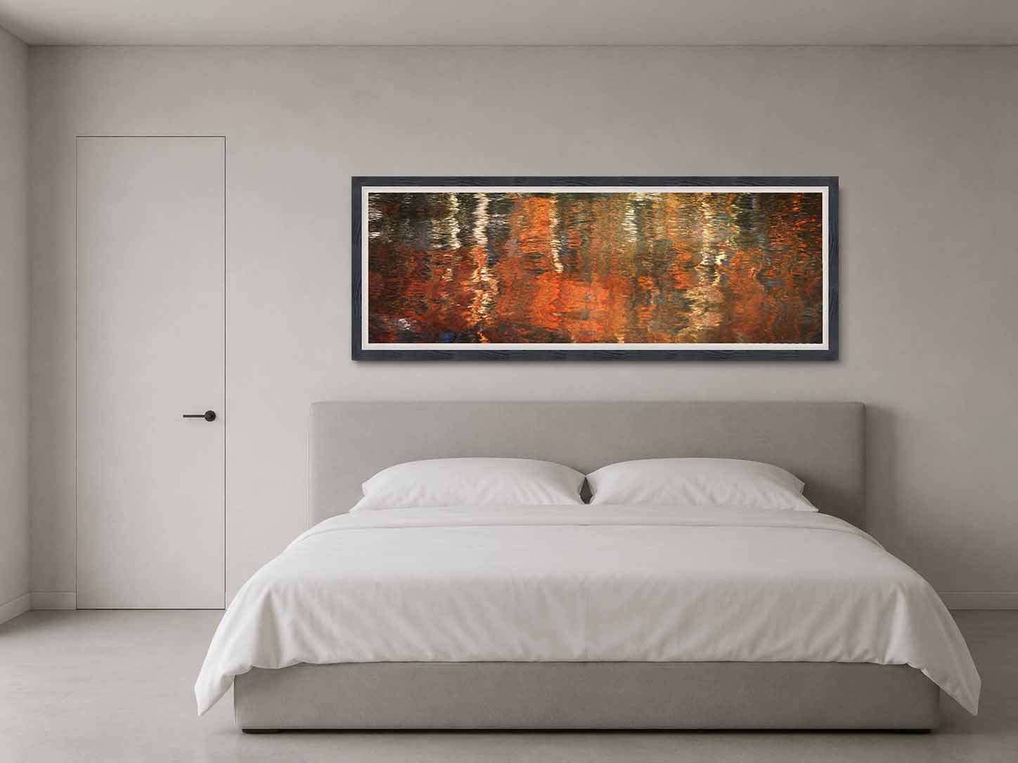
This is the strongest color in the collection, and it should be chosen on purpose rather than by accident. Measured across the frame the saturation averages fifty-seven percent and red runs seventy-four points ahead of blue, which puts the piece closer in behavior to a large rug or a painted accent wall than to a photograph. In a room of neutral materials it becomes the source of color, and the walls and the floor will read cooler beside it than they do elsewhere in the house. In a room that already has a warm scheme it reinforces rather than contrasts, which can be handsome and can also be too much of one idea. It is not a piece to hang and then decide about.
It has no subject and no orientation, and that has a practical consequence most photographs cannot offer. There is no sky, no ground, no near or far, and nothing in the frame that a viewer could name. Nobody standing in front of it is working out what it is a picture of, which means it does not compete for attention in a room where attention is meant to be elsewhere. It gives a wall something substantial without asking anyone to look at it, which is a particular kind of usefulness in a room people are in for other reasons.
The third thing is that it is a dark photograph carrying bright color, which is a combination that behaves oddly under artificial light. Its border averages well below the middle of the range while its brightest passages are three times that, so under a warm bulb the dark parts go warmer still and the whole thing intensifies, while under a cool bulb the oranges pull back and the picture loses some of its point. It is worth deciding what light it will live under before choosing a size, because the effect is stronger at the larger sizes where more of the wall is given over to it.
Not sure which size the room calls for, or want dimensions not listed here? Sizes beyond 90 × 30 are available on request and ship crated by freight. That conversation is welcome before an order is placed. Start that conversation and I will answer within one business day.
Reflections in Motion, limited edition printSteve Austin70012900USD11https://schema.org/InStock
Questions about this photograph
How small is too small for a photograph this wide?
At the Intimate size the picture is thirty-six inches across and twelve inches tall, and an abstract of this kind is more forgiving than a landscape at that height, because there is no subject to lose. The color holds, the vertical drift holds, and from across a room it does the same thing at any size. What goes is the facet structure. At twelve inches tall the individual scales of the surface fall below what the eye separates at normal viewing distance, so the picture stops being thousands of small mirrors and becomes a soft field, which is the very thing the photograph is not. You get a handsome abstract; you lose the reason it looks the way it does. The Collected at sixty by twenty is where the surface breaks into facets again. If you are weighing a size against a specific wall, choosing the right print size covers the measurements and the viewing distances in more detail.
What changes at the largest size?
The surface becomes surface. At ninety by thirty each ripple face resolves as a discrete tilted plane with its own color, its own brightness, and a hard edge where it meets the one beside it, and once that is visible the picture stops looking painted and starts looking like water. You can see that an orange facet and a near-black one are adjacent with nothing graded between them, which is the whole mechanism made visible. In the pale passages the reflected sky arrives as separate bright chips rather than as a glow. Along the lower edge the facets grow larger and flatter, because the surface there is nearer the camera and being seen at a shallower angle. At this size the sheet of water is close to actual size, which puts a viewer where the camera was, looking down. Why scale matters covers what happens perceptually when a photograph reaches the size where the eye has to cross it.
What kind of room does this photograph suit?
Rooms with restrained materials and a settled scheme. Plaster, stone, concrete, and off-white all give it room to be the one strong thing. It hangs at ordinary height and does not care about eye level, and it wants a wall it can have to itself rather than a place in an arrangement. Three things to avoid. Do not put it near another warm-toned artwork, because two sources of orange in one room read as a matched set rather than as two pictures. Do not hang it above a fireplace in use, since firelight and this photograph are the same color and the piece disappears into the glow. And keep it away from a window with autumn foliage outside it, for the same reason a picture of a reflection should not sit beside the thing being reflected. When your mind needs to rest takes the question further.
Every work ships insured and arrives with a signed certificate of authenticity.
If a piece is damaged in transit, the choice of replacement is always yours, and your edition number stays with you.
Production time runs 2 to 3 weeks for metal, 3 to 4 weeks for acrylic and paper, and 5 to 6 weeks for framed work.
Collector's Choice · TruLife ® Acrylic in Italian Frame
Collector Edition of 25· Lumachrome TruLife Acrylic · Handcrafted Italian Frame
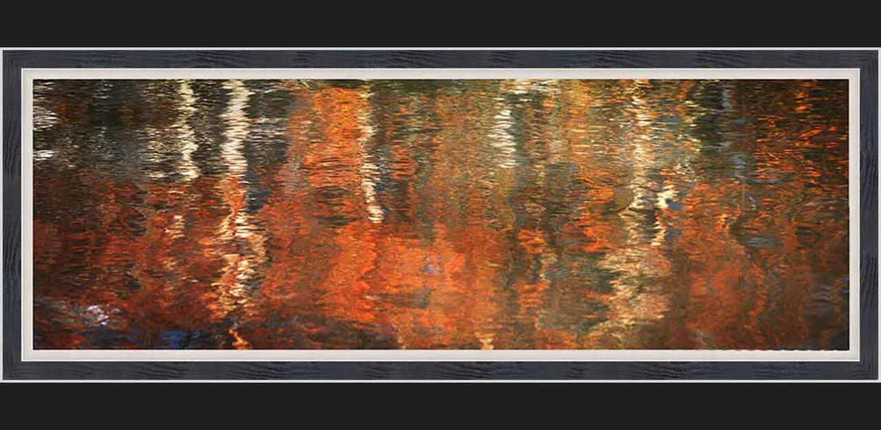
TruLife acrylic in a handcrafted Italian frame with a linen liner chosen for the image. Frame series, finish, and liner are settled with you after the order, and production begins from there. The frame and liner add about fourteen inches to the finished dimensions, worth allowing for when planning placement.
Signature Edition · TruLife ® Acrylic, Float Mount
Signature Edition of 50· Lumachrome TruLife Acrylic · Gallery Float Mount
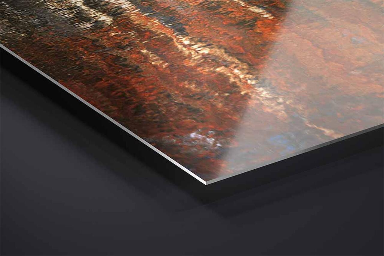
Face-mounted to TruLife acrylic and floated approximately one inch from the wall, with no frame to mediate between the image and the room. UV-resistant, anti-reflective, and scratch-resistant, with a lifetime guarantee against fading.
Signature Edition of 50· ChromaLuxe Metal Print · Gallery Float Mount
Color infused into the aluminum panel itself, floated from the wall on a concealed system. Where acrylic produces luminosity, metal produces clarity. Exceptional fade resistance with no glazing or coating required.
Fine Art Edition of 100· Hahnemühle Baryta Fine Art Paper
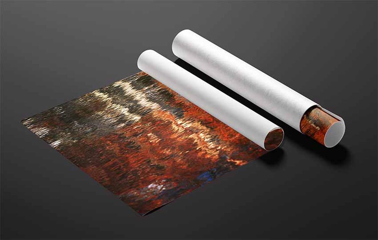
Printed without acrylic, so light meets the paper surface directly. Highlights stay luminous, shadows keep their nuance, and the surface has a tactile quality the other presentations approach differently. The understated choice, and the traditional one.
Complimentary shipping within the continental United States. International collector shipping available upon request.
Still deciding
Designing for Stillness
A guide to choosing art for restorative spaces
How to tell whether an image will still hold you in a year, how scale changes what a photograph does in a room, and how to match a piece to the work a room actually performs. It cites the research it draws on, and it is equally clear about where that research stops. About ten minutes to read.