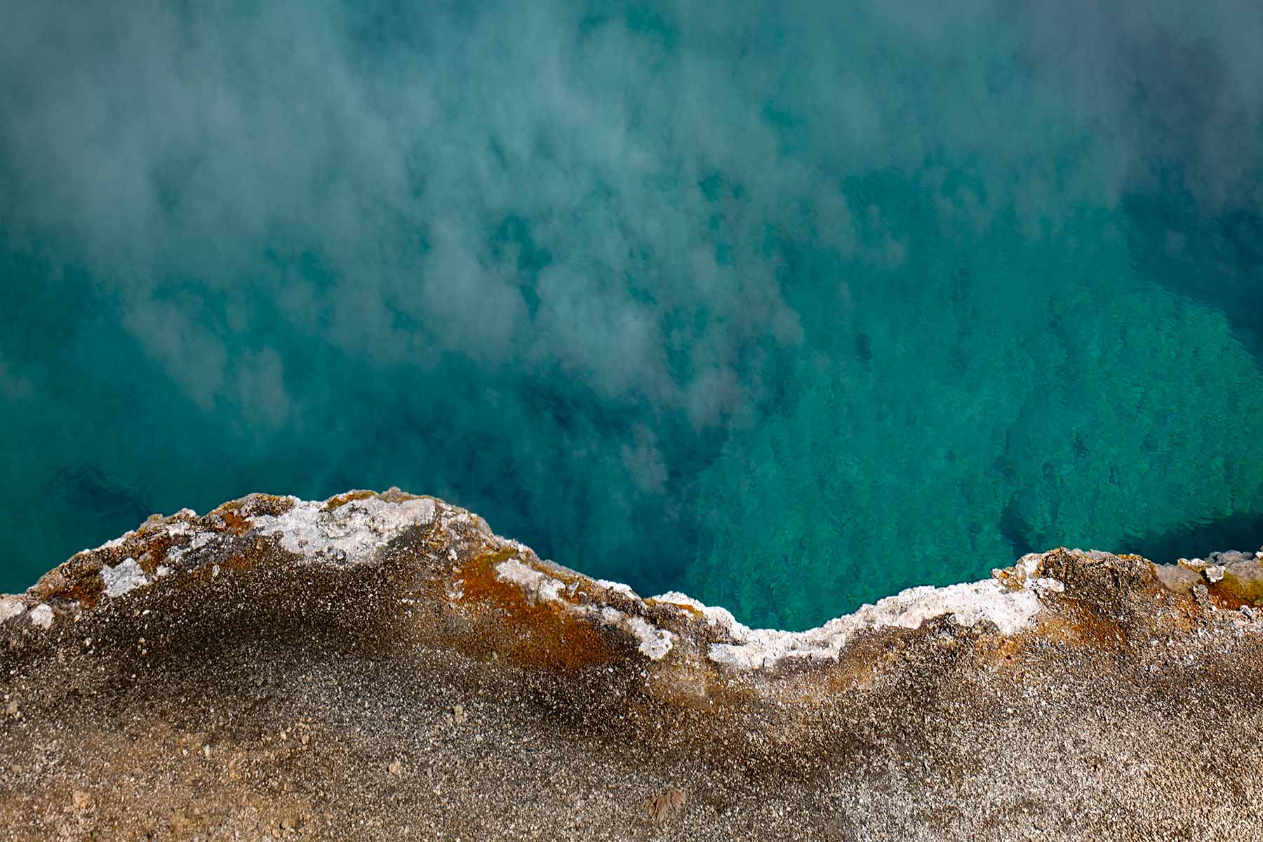
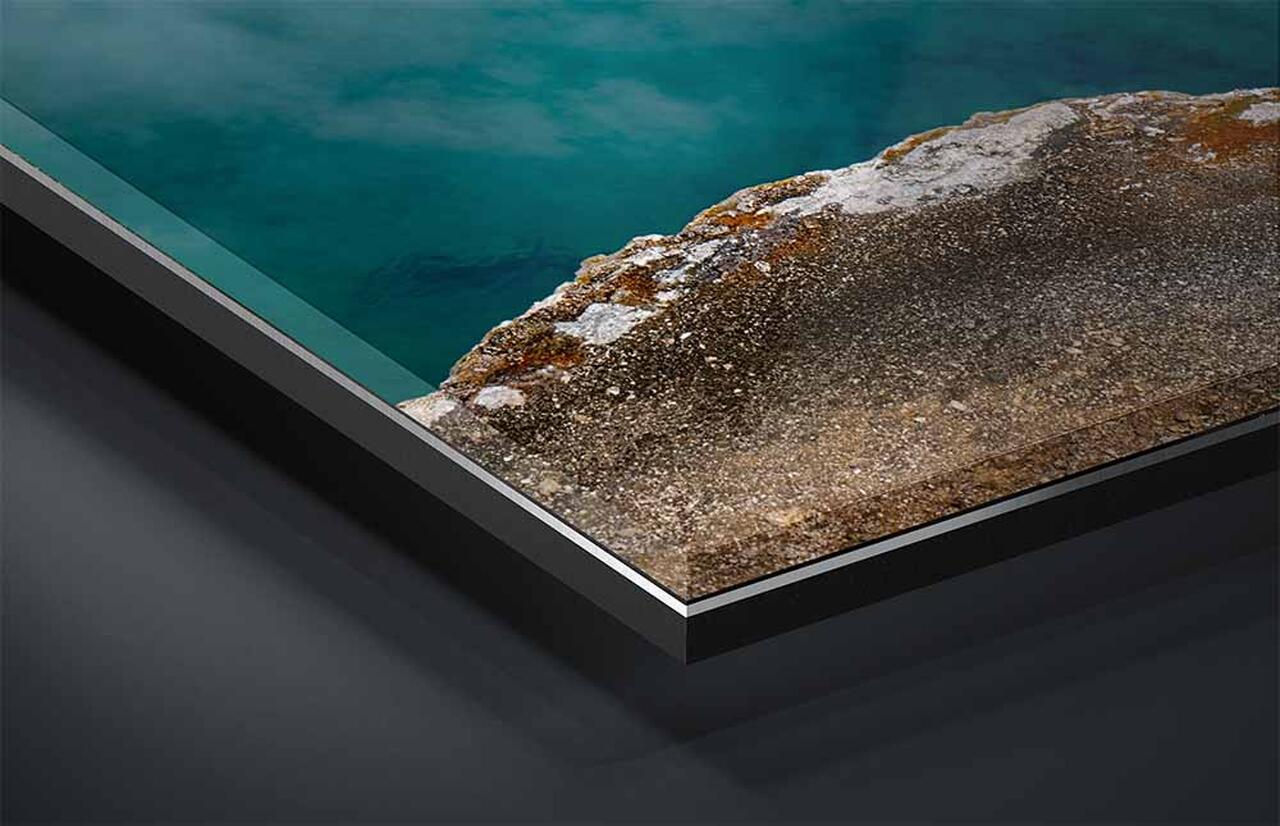
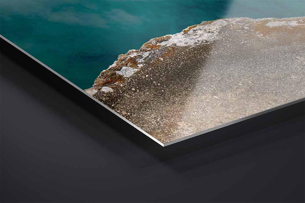
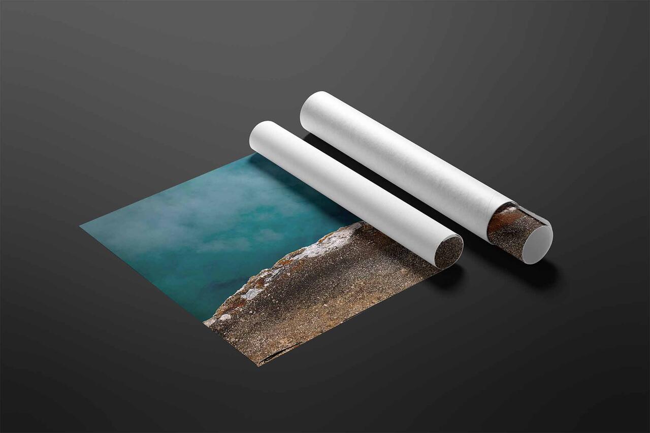
A 3:2 photograph of the turquoise water and mineral crust at the edge of a Yellowstone hot spring, Wyoming, available as a limited edition print.
Artist's Story
At Yellowstone, the turquoise in a hot spring is not in the water. Nothing down there is that color. The pool is deep and exceptionally clear, too hot at the center for most living things, and when sunlight enters it the long red wavelengths are absorbed within the first few feet while the blue scatters back up. What you are looking at is not a pigment. It is what is left of the light after the water has taken the red out of it.
The rust and orange along the crust is the opposite. That is pigment, made by thermophilic bacteria living at the cooler margins, carotenoids they produce as sunscreen against the high-altitude sun.
I came on a summer morning and, instead of stepping back for the whole pool, moved in close to the edge.
Two entirely different kinds of color meet along a few inches of mineral crust. One is a subtraction and one is a substance. The eye cannot tell them apart and does not try. It reports color as if it were a property of things, which is the most useful lie the visual system tells, and it holds up perfectly well until you stand at a boundary like this one and discover it never was.
Turquoise Spring is that boundary, where light that lost its red meets something alive that made its own.
Color is a report about light, not a fact about objects. I wrote about what that means for a photograph, and for a wall, in The Language of Light.
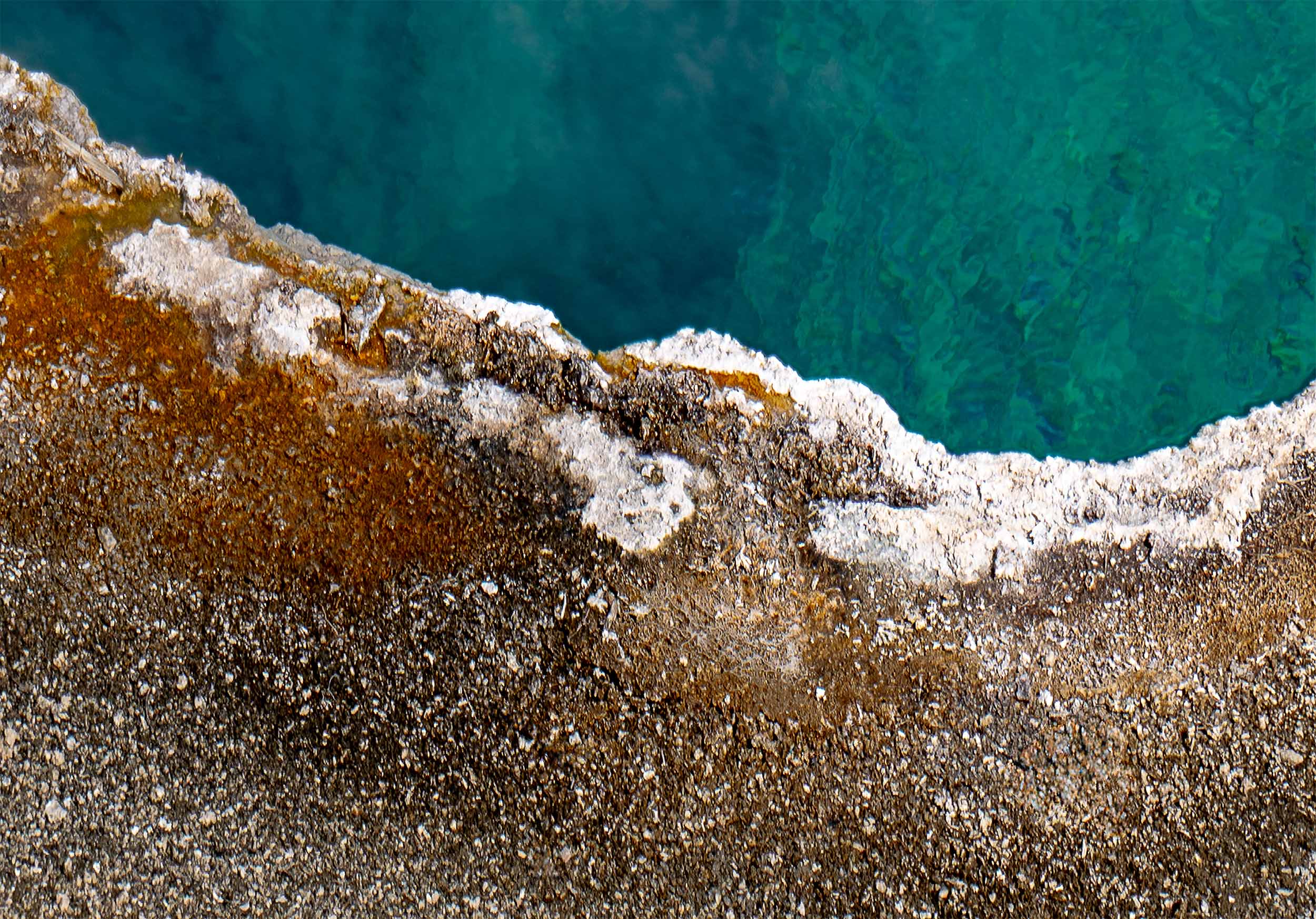
The ridge, about a third of the frame width. Grain, then rust, then white mineral, then water, all within a few inches. Click to view at full size.
About This Photograph
Photographed at the edge of a hot spring in Yellowstone National Park, Wyoming, on a summer morning. This is a single frame image in color. The subject is the boundary between the pool and its sinter crust. The blue-green of the water is optical rather than biological: the pool is deep and very clear, and as sunlight enters, red wavelengths are absorbed while blue is scattered back, the same effect that colors deep ocean water. The rust, orange and yellow on the crust are pigments produced by thermophilic bacteria in the cooler margins, principally carotenoids that shield them from ultraviolet light. Water at the center of such pools can exceed 190 degrees Fahrenheit, too hot for most life.
Location
Yellowstone National Park, Wyoming
Subject
The edge of a hot spring, where the pool meets its sinter crust
Capture
Single frame, summer morning, from directly above the edge
Format
Photograph · horizontal, 3:2
Sizes
24 × 16 in · 36 × 24 in · 48 × 32 in · 60 × 40 in
Print Media
TruLife Acrylic · ChromaLuxe Metal · Baryta paper
Edition
Limited, 25 / 50 / 100 by presentation
What it Does in a Room
A photograph of a surface rather than a view does something a landscape cannot. It behaves like material.
Three to two is the most familiar proportion there is, and that familiarity is worth something on a wall. It is the shape of a photograph, near enough, and it reads as one without any argument. It is also the most forgiving to hang. Where a panorama needs a long run of wall and a tall frame needs height, a three to two will sit above a sofa, over a console, on a stair wall, in a stairwell, or as one of a pair, and it does not have to be the only thing in the room to work. What it gives up in drama it returns in flexibility: this is the shape you choose when the wall is already decided.
Here the proportion is holding two fields and the line between them. Water fills the upper two thirds, crust fills the lower third, and the boundary runs across the frame as a single irregular ridge. There is no horizon and no sky, which is rarer than it sounds, and no sense of standing anywhere. That makes the picture read as a surface rather than as a view, closer to a piece of stone or a length of cloth than to a window, and a print like that lives comfortably on a wall in a way a scenic view does not. It also has no focal point. The eye follows the ridge, drifts into the steam, and comes back, without ever being asked to arrive.
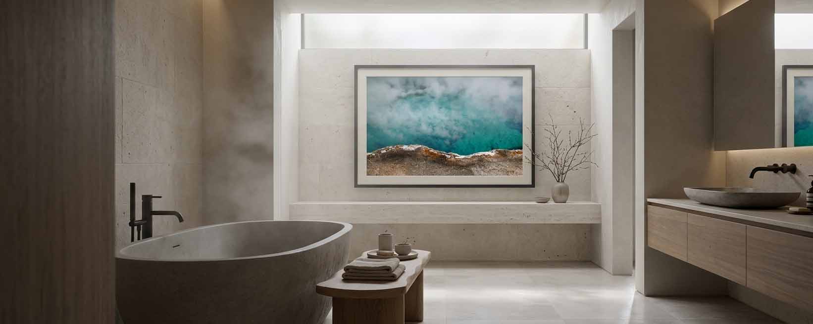
The color is the thing to plan around, because it is the only strongly cool photograph in the collection. The water runs deep turquoise at full saturation across two thirds of the frame, and the crust below it is warm brown, rust, and chalk. It does not blend into a scheme, it sets one, and the scheme it sets is cool. Against gray, slate, steel, plaster, pale stone, or white it belongs to the room immediately and the turquoise becomes the color in the space. Against warm oak and walnut it still works, because the crust carries enough brown to make the connection, though the two halves will read separately rather than merging. What it rewards most is a wall people come close to. From across the room this is a band of blue over a band of brown. From a few feet away it is steam, ripple, crystal, and grain, and almost none of that is visible from the doorway.
Not sure which size the room calls for, or want dimensions not listed here? Sizes beyond 60 × 40 are available on request and ship crated by freight. That conversation is welcome before an order is placed. Start that conversation and I will answer within one business day.
Less small than most, because the composition is two fields and a line and that structure survives any size. At the smallest offered size the picture still reads as what it is: turquoise above, mineral below, a ridge between them. What compresses is everything the photograph is actually made of. The crust becomes a flat brown band rather than a surface of grains, crystals, and stained crust, and the steam on the water becomes a haze rather than individual wisps lying on the surface. This is a photograph with no subject and only texture, so scale costs it more than it costs a picture with something in the middle of it. The larger sizes are where it stops being a graphic and becomes a place. If you are weighing a size against a specific wall, choosing the right print size covers the measurements and the viewing distances in more detail.
What changes at the largest size?
Everything, because everything in this frame is texture. The crust resolves into what it is: coarse pale grains packed like wet sand, chalky white mineral crusted over the top of them, and rust and ochre staining running through in bands where the bacteria live. You can see where the crust is loose and where it has cemented. The water resolves differently, into two layers at once, the ripple pattern on the surface and the deeper structure below it showing through, with steam lying across both. Along the ridge itself the two meet within an inch: dry mineral, then a rim of white, then water. That inch is the whole argument of the photograph, and at the smaller sizes it is a line rather than a place. Why scale matters covers what happens perceptually when a landscape reaches the size where the eye has to travel across it.
What kind of room does this photograph suit?
Cool rooms first, and it is the only piece in the collection where that is true. The water runs deep turquoise at full saturation across two thirds of the frame, with warm brown and rust crust below. Against gray, slate, steel, plaster, pale stone, or white it belongs immediately, and the turquoise becomes the color in the room. Against warm oak and walnut it still works, since the crust carries enough brown to make the connection, though the halves read separately rather than merging. Against a room that already has strong blue or green the two will compete. What it rewards most is a wall people come close to. From across the room this is a band of color over a band of texture. From a few feet away it is steam, ripple, crystal, and grain, and none of that is available from the doorway, so a hallway wall, a wall beside a desk, or anywhere people pass within arm's length gives back more than a wall you only see from a sofa.
Every work ships insured and arrives with a signed certificate of authenticity.
If a piece is damaged in transit, the choice of replacement is always yours, and your edition number stays with you.
Production time runs 2 to 3 weeks for metal, 3 to 4 weeks for acrylic and paper, and 5 to 6 weeks for framed work.
Collector's Choice · TruLife ® Acrylic in Italian Frame
Collector Edition of 25· Lumachrome TruLife Acrylic · Handcrafted Italian Frame
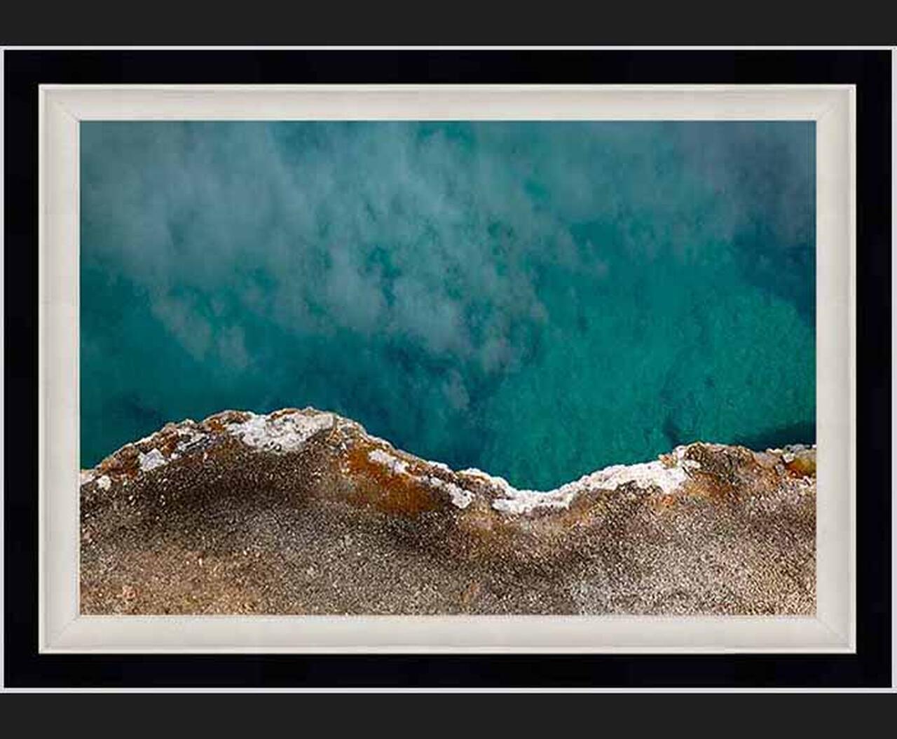
TruLife acrylic in a handcrafted Italian frame with a linen liner chosen for the image. Frame series, finish, and liner are settled with you after the order, and production begins from there. The frame and liner add about fourteen inches to the finished dimensions, worth allowing for when planning placement.
Signature Edition · TruLife ® Acrylic, Float Mount
Signature Edition of 50· Lumachrome TruLife Acrylic · Gallery Float Mount
Face-mounted to TruLife acrylic and floated approximately one inch from the wall, with no frame to mediate between the image and the room. UV-resistant, anti-reflective, and scratch-resistant, with a lifetime guarantee against fading.
Signature Edition of 50· ChromaLuxe Metal Print · Gallery Float Mount
Color infused into the aluminum panel itself, floated from the wall on a concealed system. Where acrylic produces luminosity, metal produces clarity. Exceptional fade resistance with no glazing or coating required.
Fine Art Edition of 100· Hahnemühle Baryta Fine Art Paper
Printed without acrylic, so light meets the paper surface directly. Highlights stay luminous, shadows keep their nuance, and the surface has a tactile quality the other presentations approach differently. The understated choice, and the traditional one.
Complimentary shipping within the continental United States. International collector shipping available upon request.
Still deciding
Designing for Stillness
A guide to choosing art for restorative spaces
How to tell whether an image will still hold you in a year, how scale changes what a photograph does in a room, and how to match a piece to the work a room actually performs. It cites the research it draws on, and it is equally clear about where that research stops. About ten minutes to read.